
How to Fix Your Terrible PowerPoint Presentation
You just finished your presentation and asked if anyone has any follow up questions. There are none.
It’s not because you just blew everyone’s minds. It’s because they spent the last hour silently arguing politics on Facebook, evolving Pokemon, stressing about the work that awaits them after this meeting and daydreaming about being anywhere else.
You meant well. Your heart was in the right place. It just didn’t happen for you today. It’s OK. We are here to help.
At Lightspeed, we work hand-in-hand with our clients to create and improve presentations. By following a few simple guidelines, you can vastly improve the quality of your presentation, increase engagement and have people saying, “Who is this hotshot?!”.
1. Keep it Short
 A professor once told me that, in regards to papers, “They should be like a woman’s dress –long enough to cover the subject and short enough to keep it interesting.” He was fired for making sexists remarks, but the point still resonates. Your slides should not be wall-to-wall text.
Firstly, your audience can read. If the presentation is nothing but you reading slides, then why couldn’t this whole meeting have been an email?
Secondly, you are the star. The slides are there to illustrate your talking points.
2. Show Your Audience the Benefit
 What’s your audience’s ROI? Too often, we are presented with a deck that has no clear focus. Whether obscured by by irrelevant information or lost in a sequence of unrelated ideas, it’s not uncommon to read through an entire presentation and think, “what is this about?”.
Remember that everyone’s time is valuable. Your slides should present a unified theme and message. Stay focused on the topic at hand and don’t take your audience down rabbit holes.
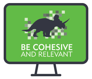
3. Use Cohesive Imagery and Color Patterns
 Cool GIF, bro. What does it have to do with this presentation?
Avoid the use of distracting animation and imagery that detracts from pertinent information. While you certainly want to use pictures and animation to get your points across, too much can become distracting to your audience.
And please, PLEASE change up the color palette. We’ve all seen PowerPoints’ default patterns. And while you’re in there, cool it with the drop shadows.
Ultimately, the more comfortable you are with your presentation, the better it will go. Remember to have fun with it. No one expects Def Comedy Jam, but keep the tone conversational and light. Based on a study comprised of terrible presentations we’ve seen, these three simple tips are key to keeping your audience focused and engaged.
For these tips and a few more, check out our infographic – feel free to share!